Background
MSA & Associates owns and operates several business on the west coast of the United States. Their executive management team relies on current information about their operations in order to make strategic decisions. Specifically, the team needs to track variations between actuals and forecasts for several of the company’s key performance indicators (KPIs). However, obtaining data from their siloed source systems is cumbersome and inefficient. Further, once data is finally available, it’s often difficult to consume.
Project Objectives
This project set out to streamline the acquisiton and integration of MSAs KPI data, as well as to visualize the information in an intuitive way for managers to be able to make quick decisions. The team needed a compact, information-dense dashboard that would enable them to view at-a-glance performance among their six primary KPIs, and to dive into the components of each, viewing trends over time.
Final Product
A link to the live report is available here.
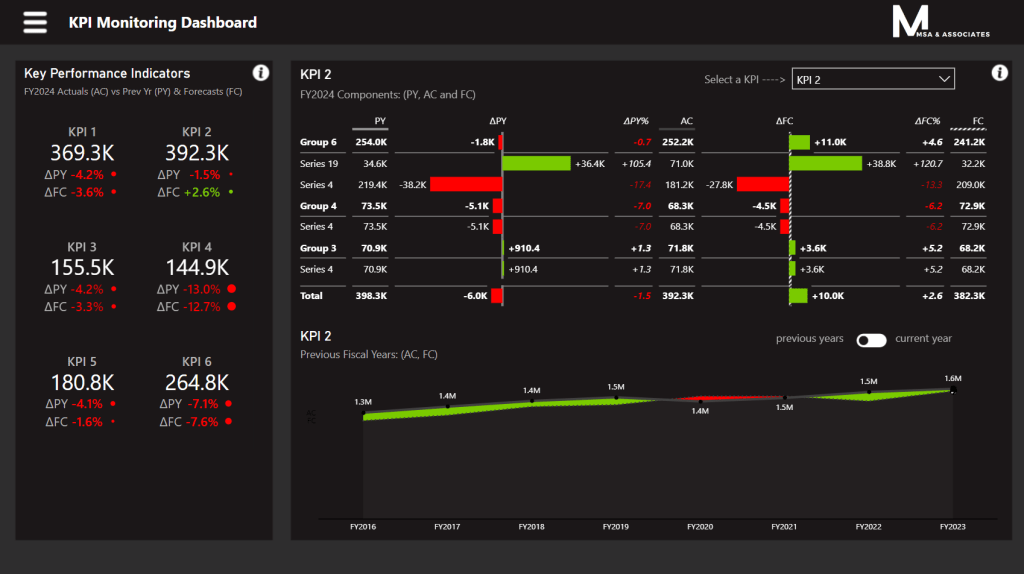
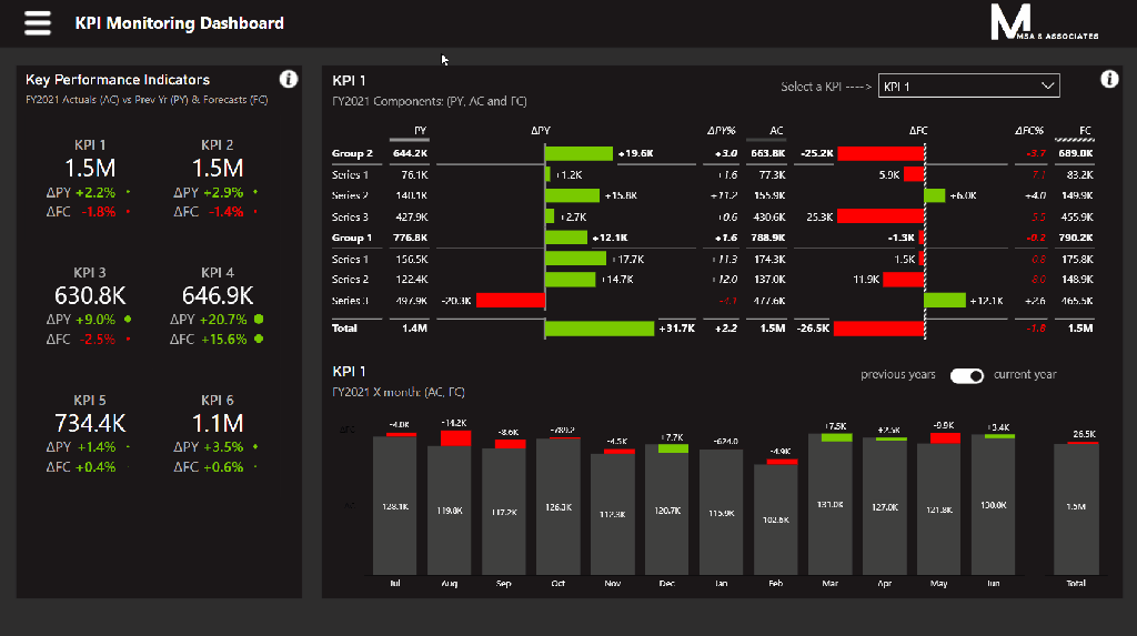
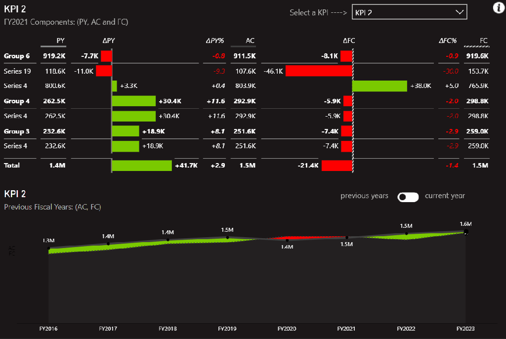
The final report shows at-a-glance KPIs for the selected period in the panel at left, while the right panel allows the team to view more detail for a specific KPI. Negative and positive variances are made clear using red and green coloring, respectively, as well as glyph size (circles at left, bars/areas at right). Managers can select a year (either calendar or fiscal) of interest,

Drill into specific KPIs in order to see variances by component, and to visualize variances between actuals and forecasts over time, both for the current year, and also previous years.
The final report includes contextual help for users to make consuming the report as frictionless as possible.